
Sales Performance Analysis Dashboard Using Excel
Objective
The objective of the Sales Performance Analysis Dashboard was to create a comprehensive, interactive, and automated solution for analyzing sales performance across multiple dimensions. This dashboard enables businesses to gain actionable insights by dynamically filtering data, visualizing key metrics, and generating automated reports based on user-defined filters.
Key goals:
- Integrating multiple datasets (Customers, Orders, and Sales) into a unified dataset for seamless analysis.
- Designing an intuitive, interactive dashboard that provides insights into sales trends, customer segments, product performance, and shipping modes.
- Implementing automation with VBA to automate data update and the generation of custom sales performance reports.
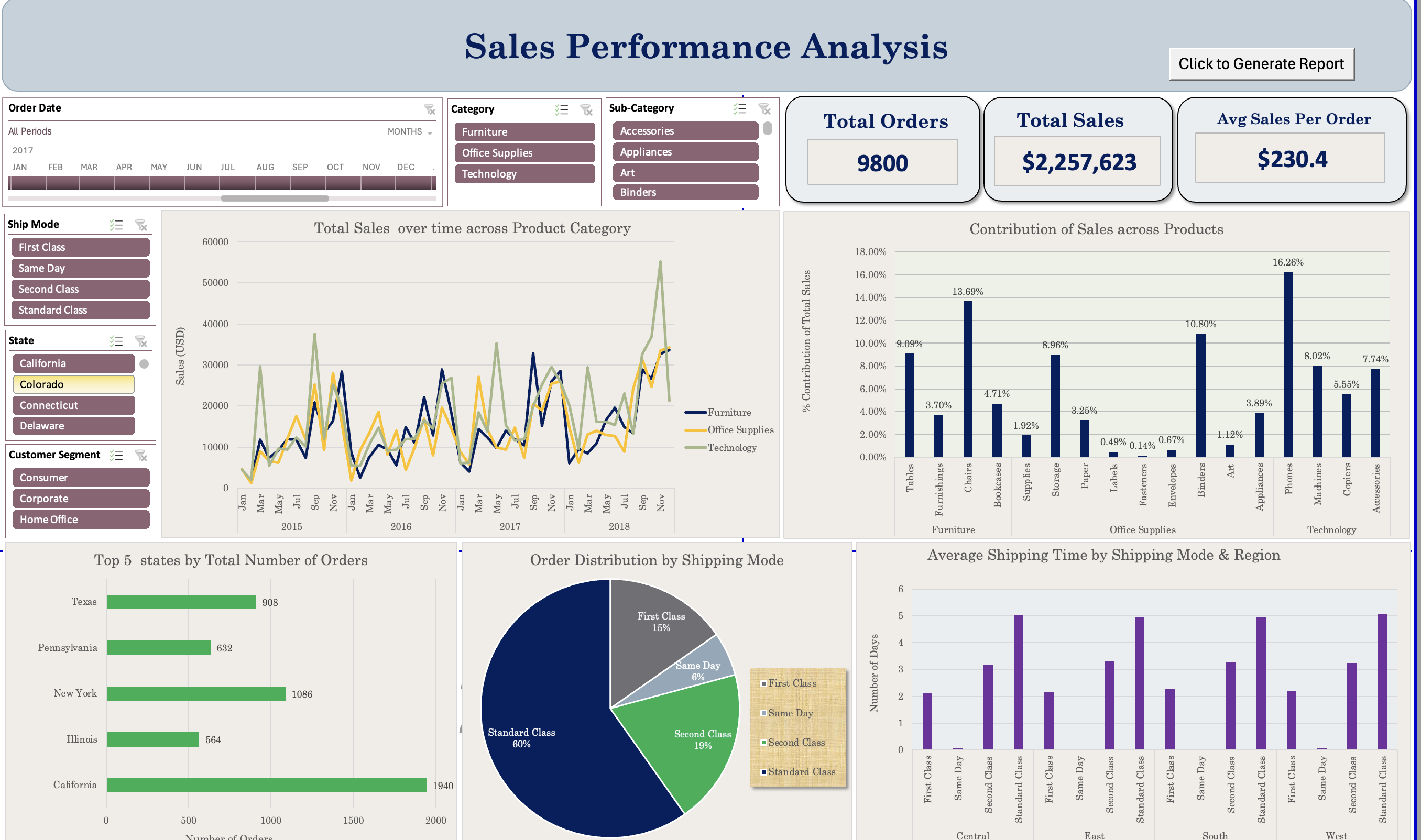
Screenshot of the Dashboard
Steps Taken
1. Data Integration and Transformation
- Datasets Used:
- Customers Dataset: Contained Customer ID, Name, Segment, and other details.
- Orders Dataset: Included Order ID, Order Date, Ship Mode, State, and related attributes.
- Sales Dataset: Provided transactional data like Product, Sales Amount, Quantity, and Profit.
- Data Cleaning and Preprocessing:
- Used XLOOKUP to combine datasets into a single table:
- Customers matched with Orders using
Customer ID. - Orders linked to Sales using
Order ID.
- Customers matched with Orders using
- Standardized columns:
- Dates formatted consistently.
- Numeric fields cleaned for accurate calculations.
- Removed duplicates and null values.
- Used XLOOKUP to combine datasets into a single table:
2. Dashboard Design
The dashboard was created in Excel with a focus on interactivity, clarity, and ease of use.
Key Visualizations:
- Line Chart: Tracks total sales over time, segmented by product categories.
- Bar Chart: Highlights contributions of sales across products.
- Pie Chart: Visualizes order distribution by shipping modes.
- Horizontal Bar Chart: Displays the top 5 states by the total number of orders.
- Column Chart: Examines average shipping time across shipping modes and regions.
Key Metrics (KPIs):
- Total Orders: Total number of orders processed.
- Total Sales: Cumulative sales amount across all transactions.
- Average Sales Per Order: Average revenue generated per order.
Interactive Features:
- Slicers:
- Filter data by date (month/year), ship mode, product category, sub-category, state, and customer segment.
- Dynamic Updates:
- All visualizations and KPIs update automatically based on slicer selections.
3. Automation Using VBA
To enhance usability, VBA was implemented to automate report generation.
Custom Report Generation:
- A button labeled “Click to Generate Report” was added to the dashboard.
- The VBA macro:
- Consolidates filtered data from PivotTables affected by slicers.
- Creates a new worksheet with the report structured as:
- Section Headers: “Analysis -> Sheet Name.”
- Data with Colorful Headers: Filtered data is organized for clarity.
- Exports the report as a PDF with the current date in the filename.
Key VBA Features:
- Event-Driven Execution: Macro executes only when the button is clicked.
- Formatting Automation:
- Automatically formats the report (e.g., column auto-fit, borders, colorful headers).
- Dynamic Data Handling:
- Loops through PivotTables to extract only filtered, visible data.
Results Achieved
1. Unified Dataset
- Successfully combined the Customers, Orders, and Sales datasets into a single structured table, enabling seamless analysis and visualization.
2. Key Insights Derived from the Dashboard:
- Sales Trends:
- Sales peaked during specific months, driven by Technology and Furniture categories.
- Office Supplies showed consistent, moderate growth across the timeline.
- Shipping Mode Analysis:
- Standard Class accounted for 60% of all orders, making it the most popular shipping mode.
- State Performance:
- California had the highest number of orders among all states.
- KPI Highlights:
- Total Orders: 9800
- Total Sales: $2,257,623
- Average Sales Per Order: $230.4
3. Automated Report Generation:
- Users can generate on-demand reports by applying slicers and clicking the Generate Report button.
- Reports are formatted professionally with section headers and colorful headers.
- Reports are exported as PDFs for easy sharing and distribution.
Conclusion
The Sales Performance Analysis Dashboard is a comprehensive tool that enables stakeholders to:
- Track and analyze key sales metrics.
- Gain insights into customer segments, product performance, and shipping preferences.
- Generate professional, shareable reports at the click of a button.
By leveraging advanced Excel techniques and VBA automation, this dashboard significantly improves efficiency and enhances data-driven decision-making. The ability to export reports as PDFs ensures that insights are easily shareable across teams, making this solution an invaluable asset for any organization.